


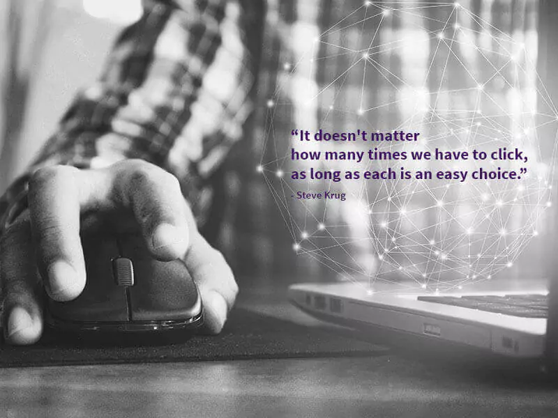
“Hey! Can we reduce the number of clicks in it?” said every client always.
As a digital product designer, I often hear this from almost every stakeholder we work with. Reducing the number of clicks is a good thing to do but that shouldn’t be taken as an axiom all the time. Adhering to such kind of rules without proper contextual considerations may lead to usability problems. We have to consider various factors before taking a call over decisions of this kind.
Generally, their point of argument comes from them taking the example of Amazon’s “1-click ordering” and uber’s “push a button, get a ride” philosophy.
There is another myth called as “3-click rule” which is that no page on your website should be more than three clicks away from any other page. The idea is that you’ll easily get to what you’re looking for because nothing is very far away.
Jakob Nielsen has tested this rule itself. His usability tests found that “users’ ability to find products on an e-commerce site increased by 600 percent after the design was changed so that products were 4 clicks from the homepage instead of 3.” (from the book Prioritizing Usability).
Imagine you’re shopping for products on an e-commerce website. You have to look and search for the products, to reduce the number of clicks, the designer might add a buy button, payment methods and inputs for them right in the same screen of the product description and specifications.
There are things you’re thinking about and remembering (cognitive), things you’re looking at on the screen (visual), and buttons you are pressing, mouse movements, and typing (motor). In human factors terminology, these are called loads. There are three types of loads: cognitive (including memory), visual, and motor.
Each load needs a different amount of mental processing resources. More resources are needed when you ask people to look at something or find something on a screen (visual) than when you ask them to press a button or move a mouse (motor). Thinking, remembering and doing mental calculations require more mental resources than looking at something on a screen.
The cost of mental resources required can be ordered as
Cognitive Load > Visual Load > Motor Load
When we’re designing a product, application, or Website, we’re always making trade-offs. If you have to add a few clicks, but it means that the person doesn’t have to think or remember as much, that’s worth it, because adding clicks is less of a load than thinking.
Progressive disclosure is another pattern of this kind which means providing only the information people need at the moment. This technique is being implemented in many recent products, apps or websites where users have to go through multiple screens to perform tasks such as filling long forms, signup or any other complex task. For example, Airbnb’s user profile completion form on mobile, UrbanClap’s booking a service and Typeform do follow this technique. People had to go through more than 10 clicks to get the task done, and at the end, they would look up and smile and say, “That was easy!” because each step was logical and gave them what they expected. They didn’t have to think. Clicking is less of a load than thinking.
John Maeda’s first law of Simplicity - Reduce
“The simplest way to achieve simplicity is through thoughtful reduction.”
Here, we have to make note of thoughtful reductions.
Although motor loads are the least “expensive” of the three loads, we still need to reduce them. One way to do this is to make sure that the targets you’re asking people to click or tap aren’t too small or too far away.
We consider loads in design, we’re usually looking to reduce the loads (especially the cognitive and visual) to make the product easier to use. But sometimes you would want to increase the load. For example, to gain the user’s attention you might add visuals (pictures, animation, video) which will increase the visual load.
Conclusion:
In the end, a designer's job is to deliver products which help the users and business to achieve their goals. This can be achieved by considering the contextual factors I mentioned above. One thinks to keep in mind is “It’s not the number of clicks but the well-labeled buttons and links that play an important role in usability.”
Product Innovation Services can help businesses enhance their user experience by providing valuable insights and solutions to create innovative and user-centric products. Get in touch with Appiness to learn more.