


Have you ever wondered why we perceive information the way we do consciously and unconsciously?
We try to learn something new about ourselves, learn new skills but often forget to learn about how everyone else thinks.
Cognitive Psychologists have helped us understand how we perceive everything, memory, attention, emotion and what drives our behavior.
We as designers are familiar with the core principles of UX but we also need to understand the human mind.
Let us dive into the theories associated with cognition
1. Classical Conditioning
It is learning through association, by pairing a neutral stimulus with an unconditioned stimulus. This was discovered by Pavlov, a Russian physiologist.
The most famous example was Pavlov's experiment with Dogs. The dog would salivate with the ring of a bell. The dog learned to associate the sound of the bell with the food.
In the same way, we can classically condition users by making them link two stimuli together subconsciously.
Ex 1: We often feel good when someone appreciates us or likes us, our brain is filled with dopamine, and our motivation increases. That's why we keep going back to social media platforms like Twitter or LinkedIn after we have posted something.
We can't all design for such big platforms, but we can try and incorporate them in other ways like gamification, social acceptance.
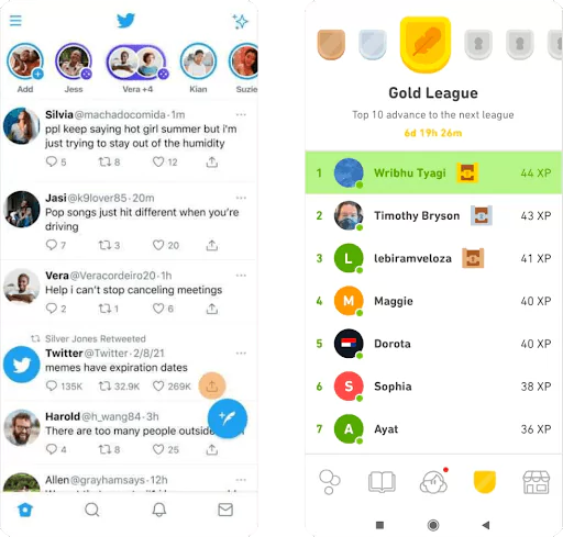
Duolingo has a leaderboard that encourages its users to achieve their target and notifies them when they have fallen off the leaderboard to get them to come back to the app more often.
People are more likely to perform the task when rewards are provided on a fixed/variable ratio.
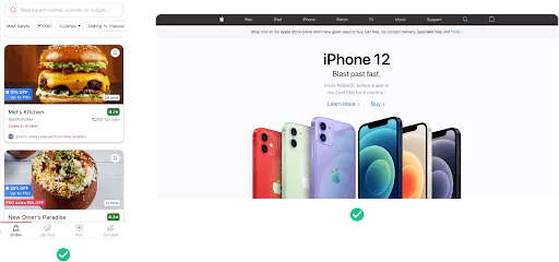
Ex 2: A lot of e-commerce websites try to provide fast delivery so that the user can closely associate buying the product with receiving the actual product.

Ex 3: Whenever a user completes an action, give them feedback. E.g., Google Meet gives proper feedback after you leave a meeting.

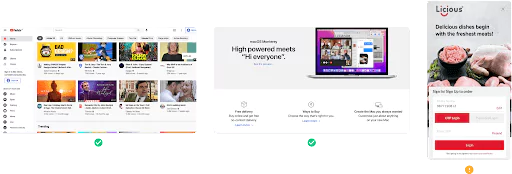
Feedback can be small and subtle as well like micro animations. Hovering over an element on a website, changes color, position, or size.
Ex 4: Micro animations used on Bayestree website made by Appiness
2. The Schema Theory
People think and perceive information in units(schemas). It is easier to process information when it is organized into sections.
Proper categorization of information would help cut down the time for product/feature research and decision-making. This would most likely get your users to want to use your product.
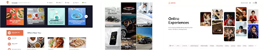
Ex 1: When you land on the Air India website, it takes a few seconds to differentiate the booking form and navigation header from the banner as it looks like it is blended with the background image.
Whereas Paytm clearly highlights the most important features.

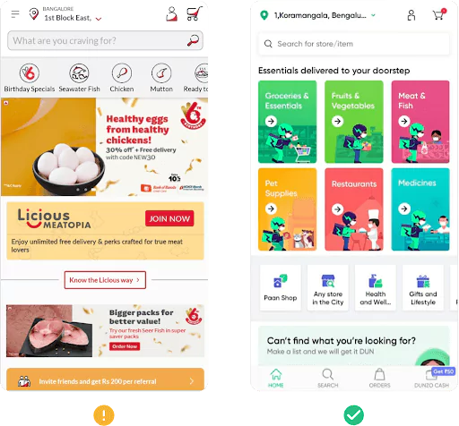
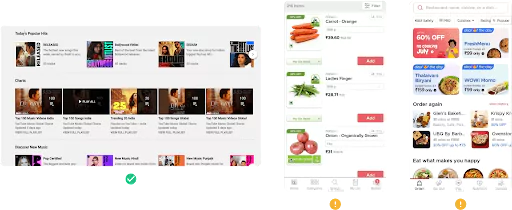
Ex 2: The Licious app categorization is a bit confusing. It displays the tab navigation on the home screen, and clicking on one of the tabs, takes you to another screen displaying the tab view again.
Whereas Dunzo has organized and categorized information really well.
3. Left to Right Theory
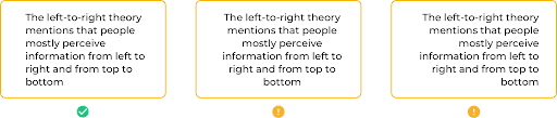
People mostly perceive information from left to right and top to bottom.
Left to Right : The optimal alignment for text, you know where each line begins and ends.
Right to left and centred alignment can be a little difficult to use.
Right to left : Works well for small blocks of text such as amount, date and so on.
Centred : Works well for small blocks of text but only a few lines should be used.
Ex: Zomato uses Right to left alignment for Amount and Time used.
Apple uses center alignment for text on the banner
4. Visual Perception Theories
People make many of their decisions based on visual perception. Let's look at a few of Gestalt's principles.
• Law of Similarity
The human eye perceives similar elements or objects as one unified object or group.
Elements with the same meaning or function should be designed similarly.
Ex 1: Youtube - A video is designed in a specific way, and any other design that looks the same, you assume performs the same function which is true in this case.
Ex 2: Apple Website - The main three features are designed the same way, hence we group them as one.
Ex 3: Licious App - The tab view(OTP login, password login) and the login button look similar, which might be confusing for any first-time users as they might assume they perform the same function.
• Law of Symmetry
Humans have parts that make us perceive symmetrical objects as part of the same group.
This can help designers shape a website or an app. The final product will look stable and properly organized.
The design doesn't have to be in complete symmetry, you can find a balance between symmetry and asymmetry.
There are few types of symmetry:
• Bilateral (Reflection) - Objects on one side of the axis are mirrored on the other side.
• Rotational - Objects rotate around a fixed point.
• Translational - Moving objects to another position while maintaining their shape, properties, and orientation.
Ex:
• Law of Proximity
People perceive elements that are close to each other as one group. Proximity is more strong than similar elements or colors. It doesn't matter if these elements have different shapes, sizes, or colors.
Make sure to bring elements close together if they are related and give more white space otherwise.
Ex 1: Youtube - Has a lot of white space between sections
Ex 2: Big Basket - The add button is placed closer to the next item, so when you first look at it you associate the button with the next item.
Ex 3: Zomato - The white space between the sections is enough, whereas the whitespace between restaurant details in the order again section is very little and it is not easy to differentiate the restaurants.
• Law of Figure and Ground
People right away recognize if elements are in the foreground or background. Help users with what they should focus on.
When we are using elements and text on a website banner or modal, we should make sure the foreground differs a lot from the background, or else there would be too many distractions, the user loses the main focus.
Ex 1 : Apple website - The main focus is on the text and button while also viewing the aesthetic background.
Ex 2: Chumbak website - There is not much contrast between foreground and background causing too much noise, whereas Airbnb has enough contrast allowing the user to focus on the main content.

5. Von Restorff Effect
Also called the 'Isolation Effect'. When multiple similar items are present, the item that is highlighted or slightly differs is the easiest to remember.
We should use it when we want to display any important or most recommended information. By doing this, we reduce the strain of going through all items.
Ex 1: Zoom highlights the best and recommended pricing option.
Ex 2: Netflix highlights the recently added shows or episodes with a tag so it's easily noticeable at first.
Ex 3: Decathlon highlights the best-selling product.

6. The Chameleon Effect
People tend to mimic the behavior of others. It happens unconsciously and can be designed in a way that provokes certain emotions.
We can use it effectively to motivate users to take the next step.
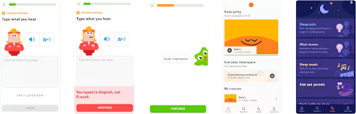
Ex: Duolingo uses their mascot and other characters with different emotions, this affects the user's judgment and decision making. Pushes users to make a certain action.
Headspace uses animations and colors to give the user a very calming feeling.
7. Serial Positioning Effect
People only remember the first and last items of the list that contain similar items.
Many experiments have shown people only remember the first and last from a set of words.
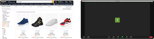
In e-commerce websites, the best-selling items are placed at the beginning and end of the list.
Ex 1: Amazon places their sponsors at the beginning and end.
Ex 2: Zoom places the most used options(Mute, End call) at the beginning and end.
Ex 3: Apps place the most used options on the beginning and end of the tab bar.

Takeaway
Just UX principles alone are not enough. These cognitive theories will help you get to know your users more and can be applied to design relevant products.
Appines is one of the top UI UX design agency in India, If you have any queries related to Cognitive Psychology Theories in UX, feel free to contact us. We, as a UI UX Design Agency will assist you in every step.