


Have you ever been overwhelmed by too much information on a presentation slide?
Being shown too much information or choices can be hard to process in one go. Our minds have limited processing power and when it exceeds our limit, it leads to a high cognitive load.
As UX Designer in Bangalore, it is our job to reduce the effort required to process information and make it as user-friendly as possible. We make websites functional, enjoyable, and easy to use.
We need to identify bottlenecks that increase cognitive load and help users overcome these barriers. Following are the application of Cognitive Psychology in UX that may make it easier for you to understand the dynamics of the phenomena,
Types of cognitive load
1. Intrinsic - Additional effort required to process new information while also having an overview of the outcome
2. Extraneous - load generated on the user by the way information is presented, in design, it could be the use of too many colors or different font sizes
Let us look at the principles associated with cognition
Cognitive Load
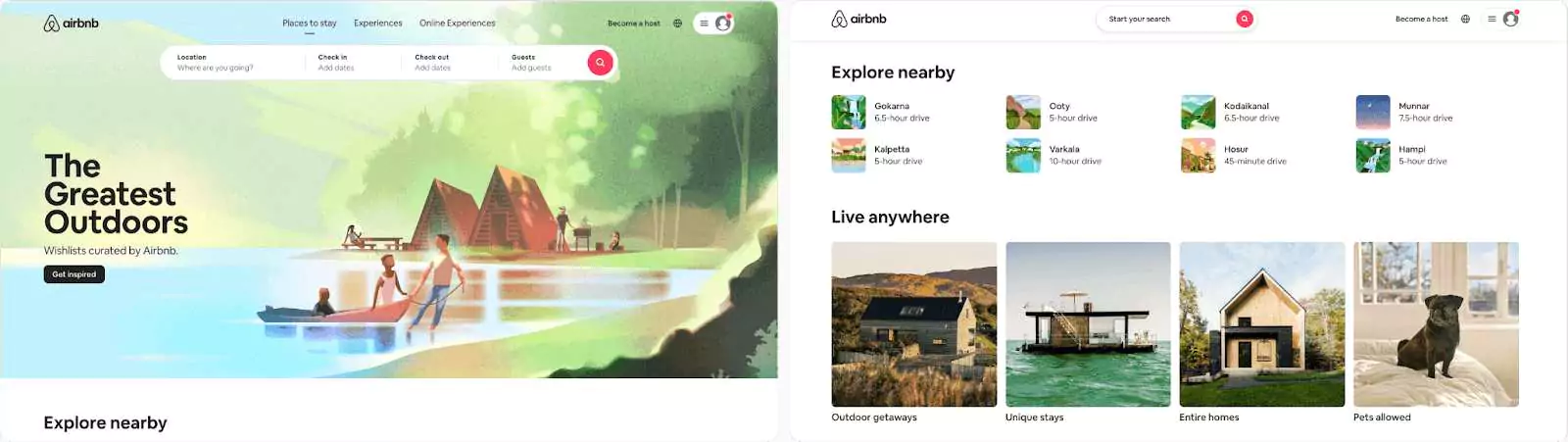
1. Number of choices
The working memory of an average person can hold 7-9 items at a time' - Miller's Law. The information can be organized in smaller chunks, it can be processed and understood with less effort to complete the task.
Limit the number of choices to what works well with your product.
Eg: Airbnb allows you to search for what you are looking for by highlighting the search area. It then provides you with relevant information like destinations, stays, and experiences
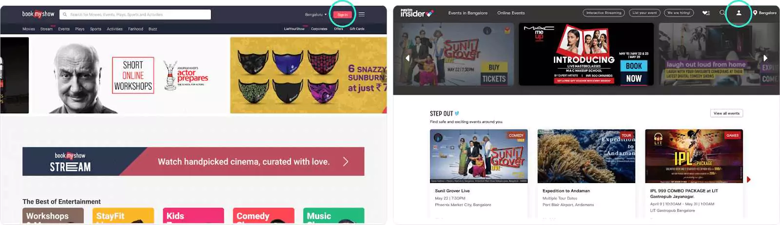
2. Amount of thought
Users have expectations when they visit your website based on experiences or time spent on other well-known websites.
It is best to use standard conventions wherever possible. Users will make faster decisions when they understand your website without having to learn something new.
For example, the Sign in and Register button is placed on the top right corner of the page on most websites. When we look at the Insider website, it takes a few seconds to find the sign-in/Register button as there is no label placed below the icon whereas in Book my show the button is quite evident.
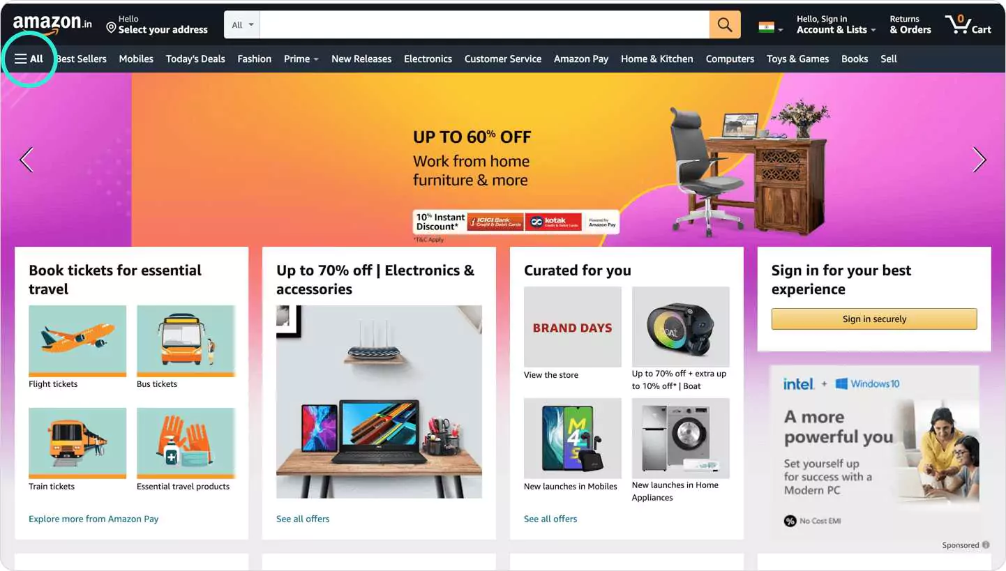
3. Confusion and choice
Showing your user all the options at a glance can lead to confusion or frustration.
If your tabs/navigation have more than 10 options available, it is best to show a few upfronts and hide the others with the option to view more.
Eg: Amazon has implemented this well, showing few popular options and the rest can be accessed from the hamburger menu.
Cognitive Barrier
A cognitive barrier is something that prevents the user from performing the action required to complete their task
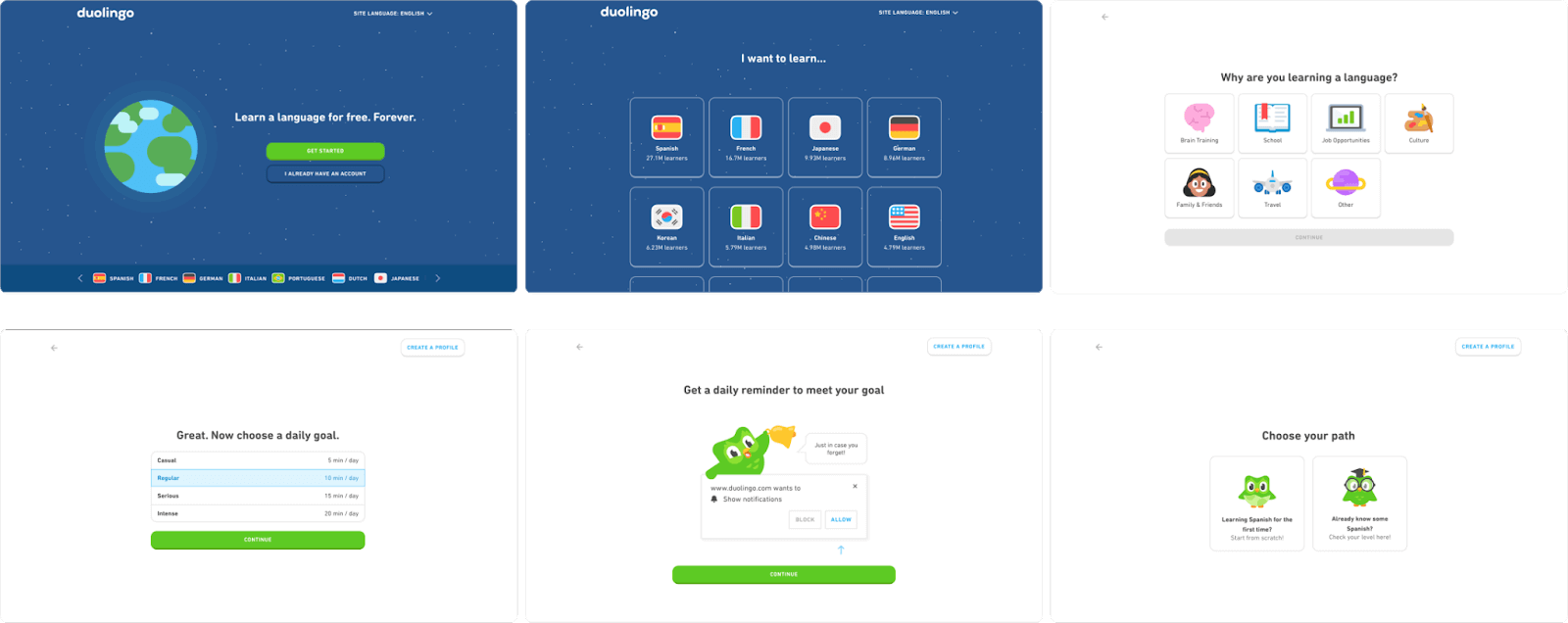
1. Number of steps
It is essential to know when to have many steps and when not to. Include only relevant information with no redundancies.
At times it is better to have more steps with a low cognitive load than to have fewer steps that make it too cluttered adding on to the user's working memory.
Eg: Duolingo's onboarding process is spread out into many steps. This creates a good experience as users can easily process small chunks of information at a time
2. Length of steps
The length of the step depends on the user's expectation while keeping in mind the cognitive load.
A user might expect to spend some time applying for a credit card online but might expect to spend less time when he wants to view an online restaurant menu.
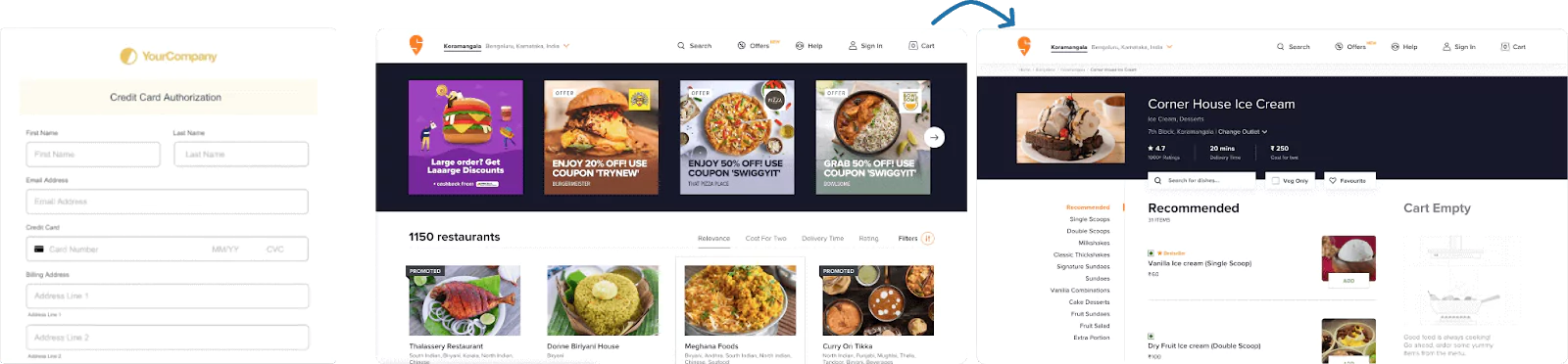
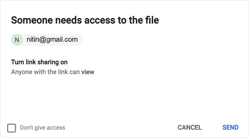
3. Difficulty of steps
The difficulty varies from person to person and also from the user's experience. He/She wouldn't mind spending more time on a step once it is explained why it is going to take longer. This is good as it could prevent errors from happening in the future.
Eg: While sending a large file as a goog
Takeaway
With these principles, you can substantially reduce the user's cognitive load and ensure they are not wasting their attention on unnecessary information that will leave them frustrated.
'The less they think about how they need to achieve their goal the more likely it is they will achieve it'- Steve Krug
As a leading UI/UX Design Agency in Bangalore with over 10 years experience in UI and UX design, we deliver you well-crafted design services that can bring your ideas to life and make your app stand out. Our UI/UX designers in Bangalore are personalized and crafted to suit the diverse needs of our customers.