


We all might have come across a product or a service that gives us a tough time in understanding it or working on it. Every user must have felt frustrated at some point in time using the product, but we tend to move ahead by learning from our past experiences.
But this is only a single side of a story and there's another side too of it, which includes a team of designers doing their research, validating assumptions, collecting user feedback, testing the product, and working on all the checklists of designing to make the product user friendly and stand out in the market.
But what leads to the gap between a UX UI Designer in Bangalore and a user? Let's discuss on few factors on the same.
So the first point which is important in designing a product is understanding the product's Accessibility and Usability.
1. Understanding Accessibility and Usability
A design is only useful if it's accessible to the user: any user, anywhere, anytime. Accessibility is all about people. It is essentially the practice of ensuring your product is as usable by a wide group as possible, whereas usability is more focused on the goal or task effectiveness. Usability is about addressing general user needs, usability is NOT about the specific needs of people with disabilities. The thing is, one can't exist without the other
Researchers are focused so much on usability, but if what they've designed isn't even accessible, then there's no point in even considering usability.
Basic characteristics that are to be kept in mind for Accessibility and Usability are-
I. Accessibility- The interface should be navigable by any user, regardless of technology familiarity or disability, for example, someone with color blindness or physical impairment.
II. Usability - The interface should be easily understandable so that a new user will have no trouble completing common tasks.
To understand the point better we have the Amazon webpage as an example-
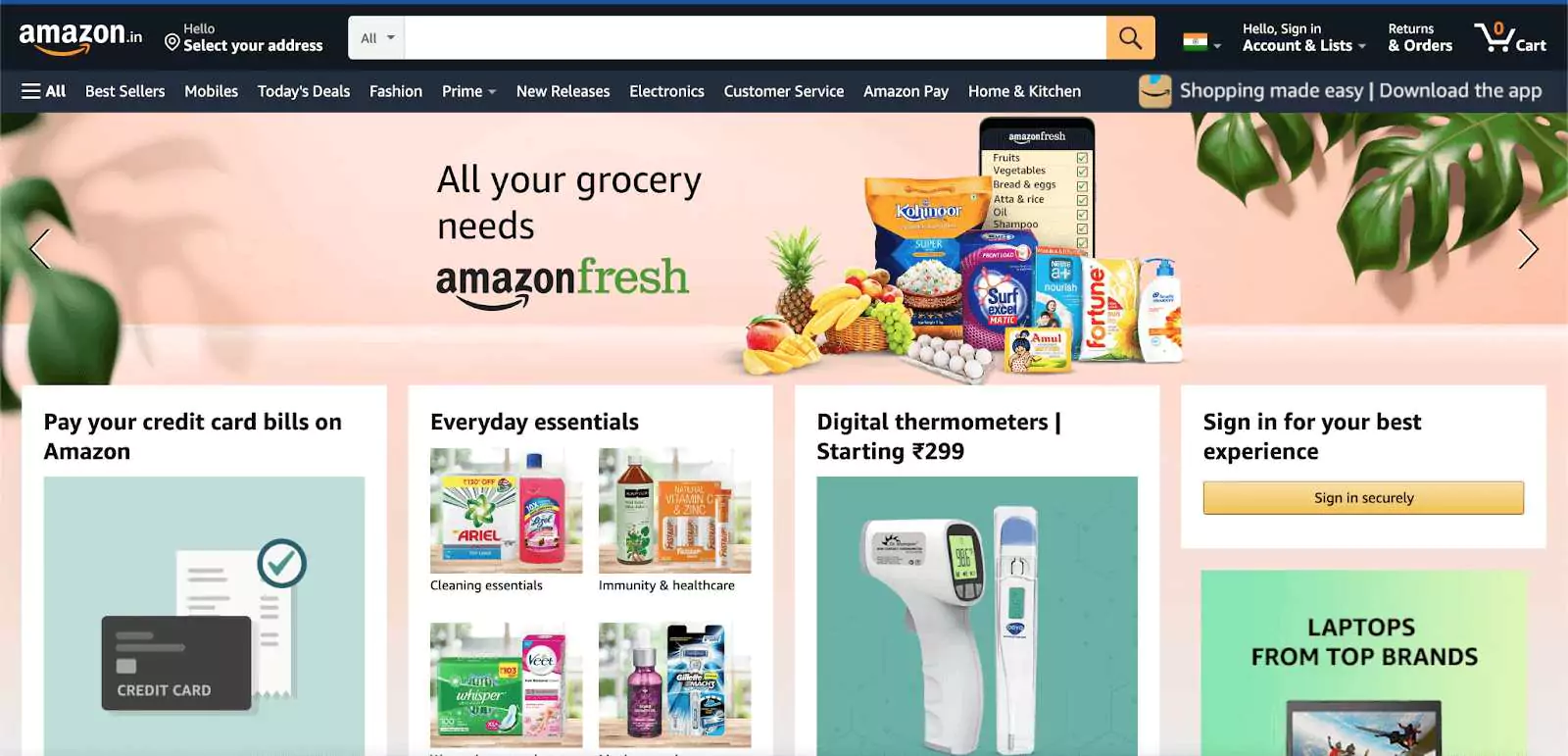
Amazon is a perfect example of an accessible website for several reasons.
First, the point of accessibility of website is marked by its desktop version. The desktop version of the site is optimized for both tablets and desktop screens. The layout is flexible and adjusts automatically as the screen size is reduced. For mobile, there is an explicit version of the site with a clean interface, less clutter, and a clear hierarchy of the content.
Amazon is actively concerned with its accessibility. On their website, they state: "We're always looking for ways to improve the usability of the site for our customers, including those with disabilities." For screen readers, they specifically recommend their mobile site with a cleaner presentation of the content.
Moving forward to the next point of our topic.
2. The Error messages
Nothing frustrates your users more than the repetitive failed attempts while performing a task and getting stuck during the process. We are naturally curious and we seek answers for everything that happens to us, failing to ends up in confusion and dissatisfaction.
Hence, Creating the simplest website error message is important for an excellent user experience.
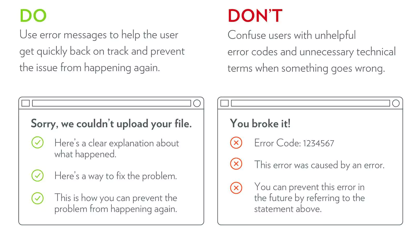
For a satisfactory user experience, error messages should have well-defined what, why, and how.
I. What was the problem?
Use plain language to help them to understand the error and avoid unnecessary technical jargon. Don't use unhelpful error codes.
II. Why did it happen?
Explain to them why the error occurred.
III. How to fix it?
Always provide them with an option to get it fixed in a simple language.
To understand the above points further we have some examples-
#1
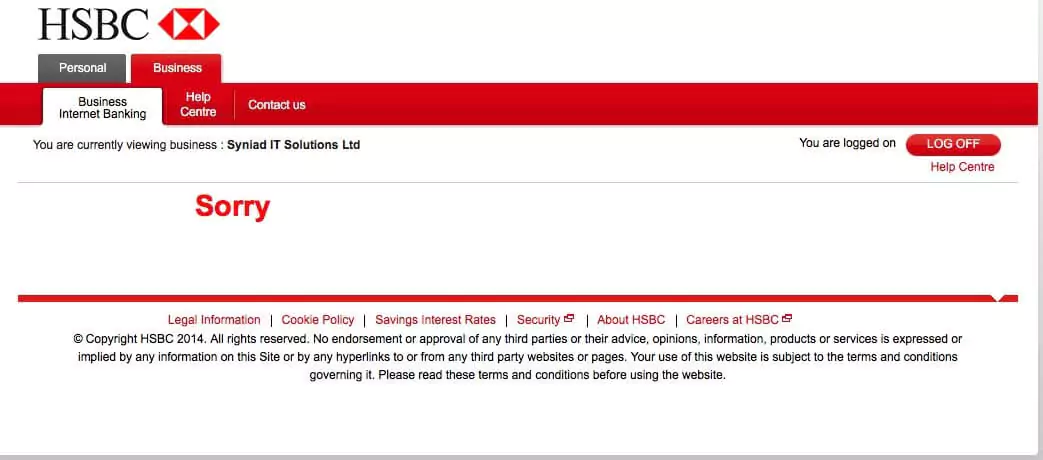
So, we have the HSBC bank webpage as an example. Here the user has encountered a failed operation.
They have just displayed a sorry message for the user. Instead of this, they could have explained briefly what exactly happened, why it happened and the solution to fix it.
Moving forward for the second example-
#2
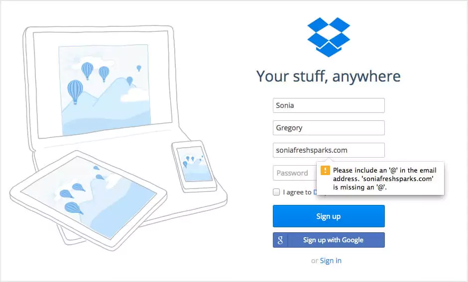
Here we have an example of Dropbox. While filling up the Signup form they have mentioned the problem. So the user can easily understand he/she is missing "@" in his email id. Rather than showing an error message without any explanation.
Moving forward to the next point of our topic.
#3. CTA positioning and its context
No matter how distinctive color your call to action button has, it won't be visible to a visitor if it is situated at the bottom of a long landing page. CTA guides the users through the website and helps in the fast completion of their tasks.
So, CTA has a few basic characteristics that are to be kept in mind.
I. A defined shape or border
II. A different color from their surroundings
III. Text on them
Example of CTA Positionin
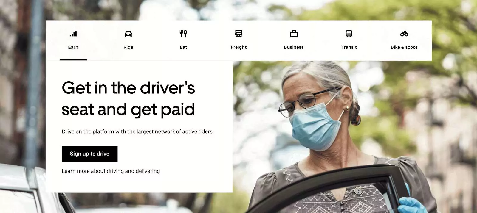
We have the Uber Home page as an example. They have a prominent CTA button to guide the user about the main objective for his visit to the website.
Ideal CTA Placement?
As there's no fixed rule for the placement of a CTA but there are few things that we should keep in mind while positioning the button.
According to Fitts's law, the farther the target is and the smaller it is in size; the more difficult it is for a user to land on that target.
The ideal placement of the CTA button should meet all these criteria:
I. Easily visible in the first scan
II. Positioned within the natural reading / Scanning flow (F-pattern or Z-pattern)
III. Prompts the user to take action
IV. visual cues on the screen which brings attention to CTA
Example of CTA Positioning-
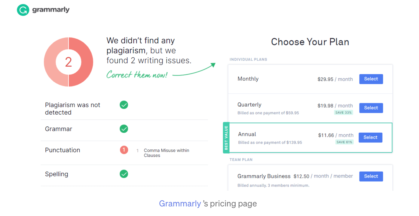
We have Grammarly Pricing Page. They have used an arrow as a visual cue to direct the user's attention towards the next possible action on the screen.
CTA copy
While CTA design is important in drawing the attention of your user, it's the copy of your CTA button that has to be compelling enough to get them clicking on it.
The best practices for a perfect CTA copy would be:
I. To use verbs at the start of the copy - like Start, Stop, Build, Join, Learn, Discover
II. To create a sense of urgency - Only X days left, Offer ends on "date", Closing soon, Limited supply
III. Should not be more than 10-15 words
Example of CTA Positioning-
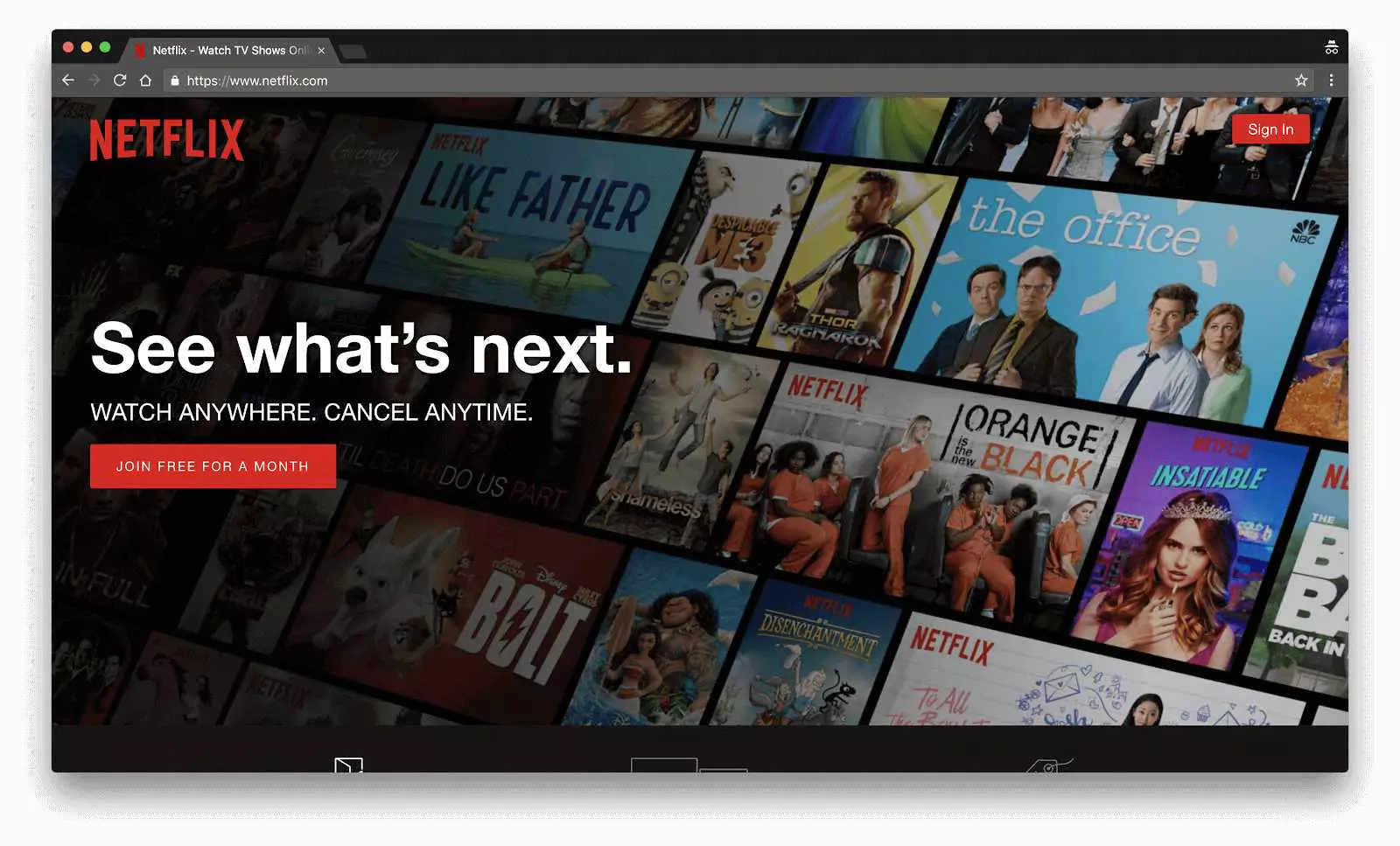
We have a Netflix Web page as an example. They have a clear copy in their CTA as our plan is free for a month so the user does not get confused and has a clear view of canceling the subscription before 1 month if he does not want to go forward with the plan.
Moving forward to the next point of our topic.
#4. Blindly following the trend
Following a trend is one thing and blindly following trends without testing their usability is another. Given the world we live in today, technology changes at the speed of light; innovations are happening everywhere around the globe. Trends may come and go but psychology stays, people, take time to adapt and to embrace change.
Best practices to save yourself from falling into the trap of trends would be :
I. Create an MVP to check the feasibility in the initial phase.
II. Know your user better... Who's the end customer!
III. Make features easily recognizable
For Example of the same-
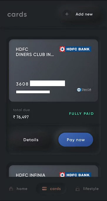
We have a Cred app. They have always been on point with their updated neumorphic look. Given that cred had a satisfied user base but still, this changeover to neumorphism lacked basic usability principles with a major concern around navigation and wasn't appreciated much. Users did not react to this changeover as they were expected to.
Setting a trend often involves risks but taking measured risks can be worth the effort and time.
Takeaway
To Design is not only justifying but also answering the "Why"s in your design. As much as we designers are problem solvers, we also determine what companies make and that determines what people use!