“The web is not a place anymore, it’s a person… a very busy person.” – Ethan Marcotte
The internet we use these days is far from static, equivalent to the individual in question who is constantly on the go. We jump from phone to tablet to laptop, expecting smooth transitioning between each device and the best possible observing experience. Responsive web design (RWD) takes center stage in this energetic dance, guaranteeing that websites flow naturally to any screen they come across.
So, just what is this magic of RWD all about? To put it simply, it's the art of creating websites that can adjust their layouts and content to suit the available space, much like an evergreen branch. The days of using our tiny phones to squint at desktop versions or visit specific mobile-friendly websites are a distant memory. In a world of multiple screens, RWD is the universal solution.
But wait a moment. Let's take a closer look before establishing RWD to be the undisputed champion of web design. How does this flexible magic operate? What are the advantages and possible drawbacks? As we travel through the intriguing world of responsive web design, where screens may change but your user experience is always pleasant, secure your seatbelt, dear reader. With each flexible pixel added, are you prepared to welcome the web's future?
Why 'Responsive Web Design' is important?
2024 will see the triumph of responsive web design (RWD), and for good reason! It perfectly displays your website on PCs, tablets, and smartphones—the devices from which more than 58% of all traffic globally comes. Google also finds it appealing, giving mobile-friendly websites a higher ranking in search results. Technology aside, RWD makes users satisfied. They anticipate flawless interactions across all platforms, and strange substitutes annoy and reduce conversion rates. Reaching today’s mobile-first audience and succeeding online requires RWD, not just a passing trend.
Years have passed since the introduction of responsive web design, or RWD, but its significance hasn't dropped. Let's delve into some key insights from 2023:

Mobile dominates:
- Exploding Topics reports that 58.43% of website traffic originates from mobile devices across the globe and the number keeps inclining.

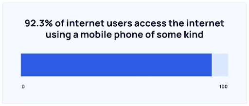
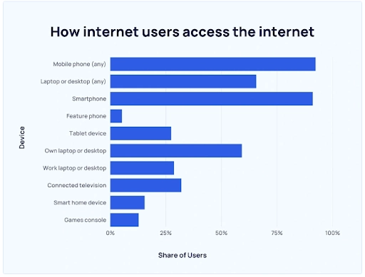
- 92.3% of internet users gain access to the internet through a mobile device.

- Furthermore, 4.32 billion mobile internet users use the internet globally at this time.
Google necessitates it: Websites optimized for smaller display sizes are given priority in mobile-first indexing, which affects SEO and visibility.
The expectations of users are very clear: They want seamless interactions on all platforms, and they avoid uncomfortable, unresponsive websites.
With constant adaptation to the changing digital landscape, responsive web design is a continually growing field. Keeping up with these trends enables web designers and developers to produce websites that offer incredible user experiences on all platforms. The latest trends in responsive web design are influencing the way we interact with online content:
- Mobile-First Strategy
- Clear and Simple Design
- Interactivity Media and Gesture-Based Navigation
- Optimizing Readability and Typography
- Intelligent Automating and Privatization
- Inclusive Design and Access
- High contrast and dark mode themes
- Integration of Virtual Reality (VR) and Augmented Reality (AR)
Being able to reach today's mobile-focused audience is based on RWD, which is more than just a trend. Implementing RWD is obligatory in 2024 and beyond if you want to succeed in the digital world.
Advantages of Responsive Web Design
- User Experience Gains: RWD provides seamless device transitions, which keeps users happy. No more blinking at small text or fumbling with complicated layouts. Content users tell their friends, stay longer, and convert more.
- Consistency Triumphs: A unified website, ideal interaction RWD confirms that, regardless of screen size, your brand communication and content appear to be outstanding. Reliability encourages trust and maintains user interest.
- SEO Soars: Google loves compatibility with mobile device sites. RWD increases your site's search ranking and makes it more visible to mobile users—who make up the majority of searchers—on their mobile phones!
- Cost-Cutting Champion: One the code base, multiple devices. RWD saves you money and time on development and maintenance by doing away with the need for distinct mobile sites.
Why it is important to choose the right responsive web design partner?
The next big thing in the perpetually shifting world of online presence is Responsive Web Design (RWD). The initial step to an effective RWD implementation is choosing the right partner. Leading web design company Appiness is a reliable option.
Choosing the correct partner signifies smooth device adaptation, improving user experience, and expanding reach. Expertise, portfolio, and client endorsements are important factors considered during this selection process. Appiness is the best in all of these domains, providing customized solutions for an online presence that is both aesthetically pleasing and responsive. With the right partner at your side, make the wise decision to embrace the future of web design.
Responsive Web Design Implementations
Responsive Web Design (RWD) is the newest new trend in the constantly modifying web development world. RWD implementations improve digital experiences by seamlessly adjusting throughout devices. Effective case studies demonstrate its influence, with Starbucks and Airbnb setting the standard. Developers get insights into the delicate equilibrium between functionality and aesthetics by looking at these noteworthy examples.
Their success stories echo the idea that implementing RWD improves accessibility and user engagement. Reviewing eye-catching designs stimulates ideas for new endeavours. With its adaptable grids and media queries, Responsive Web Design is not just a trend but a revolutionary force reshaping the world of digital media. Steer clear of the pack, ride the trend, and let Responsive Web Design take your projects to the next level!
In closing, responsive web design (RWD) has to become the standard for web design by 2024 due to the dynamic nature of the internet, which corresponds to a perpetually occupied individual. The adaptability of RWD to multiple screens ensures an uninterrupted and enjoyable user experience across devices, satisfying the demands of the increasingly mobile-focused audience. The fact that mobile traffic is so widespread, that Google favours mobile-friendly websites, and that users want responsive interactions all highlight how important it is.
RWD is more than a trend; rather, it is a vital component for success on the internet, as we continue exploring the constantly shifting landscape of web design trends. A reputable partner for successful RWD implementation is Appiness, a top web design company. Appiness's preference for experience, extensive portfolio, and glowing client testimonials guarantee seamless device scalability, improved user interfaces, and increased market penetration. Using Appiness as your partner and embracing RWD will help your initiatives advance into the future when having a visually appealing and responsive website is essential. Take advantage of the current trend, go for applicability, and let responsive web design improve your online projects.


